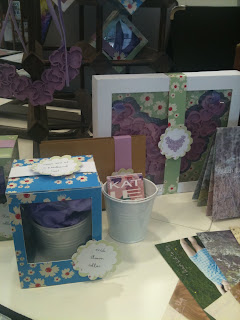
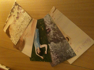
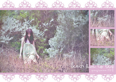
Just a couple pictures of my work at the No Show exhibition. I'm really pleased with how it all looked put together!
Online journal documenting development of my final major project - print and accessory designs under the title of 'Beach Hut to BBQ'.
Sunday, 15 May 2011
Final Packaging
In keeping with the ecclectic feel of the brand but also to create a uniformed look i have used 2 variations of the same daisy print mixed with the purple of the necklaces and white card. This stops the packaging from looking too predictable. I have attached labels with the names on, and for the acrylic jewellery, an illustration. I a really pleased with the results as i think everything looks professional while still getting across the brand identity. They can be easily packaged for sending, displayed in a boutique and sat on someone's dressing table all while still being inside the packaging. I think the boxes will also make them suitable for the giftwear market which opens up a whole other customer base.
Packaging
As my prints are very bold and diverse i decided to keep the packaging simple to provide a more uniformed look therefore i picked the daisy print to not distract from the jewellery. I based the construction of the boxes on the net of the perfume box i mentioned previously and adpated the measurements. An acetate 'window' allows the product to be seen but also protected. Unfortunately the vacuum formed pieces were done too close together to allow me to fold them down and be free standing so instead i have mounted them behind a piece of card folded to stand up. I now prefer this as it disguises the rough surface of the plastic and stops it looking so mass produced. I have also created a base for the buckets to sit in to stop them moving around and will hide this by making the 'window' on these start slightly higher.
Final Accessories
Images documenting the construction of my textile necklaces - now named 'bloom' collars due to the organic, spring feel to them - and stitched headbands. Although i developed the technique of the bloom collars throughout my sketchbook, the actual designs were difficult to document as each shape turns out different from the next and the whole process was developed as i was pinning on the stand. Some shapes also come out smaller when burnt so the process was always evolving. This is a good selling point as it ensures each item is different from the next instead of being mass produced replicas. Previously when suggesting the necklaces could be worn in the hair i used a very large one which went all the way round the head which is quite a statement and may deter people who are less confident experimenting with fashion so instead i have made a smaller necklace/headband to be worn at the side - perfect for weddings or just brightening up an outfit.
Promotional Material
After evaluating existing lookbooks i could not decide on just one approach to promoting my brand so decided on different applications for different situations. The double sided posters contain only contact information so would be ideal to hand out with purchases and once people already have an understanding of what the brand is about. Having said this, including 2 strong images and limited information will hopefully encourage people to find out more about us and look online so these can be distributed in places where my target customer may be - beach bars, independant boutiques, music venues etc. The mini-look books include information about the brand, our customer, contact details and a small sample of print samples. These will be used at Graduate Fashion Week and sent to potential stocklists to give them a brief overview of the brand and if they are interested i can then send on the press packs with more information and imagery. These are in the form of postcards with headers to match the prints on my business cards for a more professional look. By producing postcards i am hoping to encourage people to stick them up - on a notice board, on the fridge etc - and therefore they will be reminded of the brand everytime they see them as opposed to producing a document which will be filed away.
Friday, 6 May 2011
Vacuum Forming
In preparation of making my packaging for the jewellery i have vacuum formed the bases of my acrylic pieces so they will then fit neatly into the boxes without moving around. I had to form the shapes before gluing the pieces together as otherwise they would have had the detail from the different layers which would prevent it from lying flat. The ring piece is too protruding so would pierce through the plastic so i need to think of a different way of packaging this. The buckets would also be a problem as i would like only half a bucket vacuum formed otherwise the whole thing will be moulded around meaning i cannot get it out again! I could get around this by lying it top down rather than on the side but this would again be difficult. I would also need to consider how to leave a vacuum bubble for the textile necklaces to sit slightly above the bucket. To get around these problems i will vacuum form just a circle base for the bucket to sit in.
Lookbook development
Here are some developments for potential booklets/double sided posters to promote my brand. In the top 2 i used one of my necklace designs to frame the picture as i want to add a more quirky feel than just having a blown up image. I really like the cropped images on the bottom example as they show off the different pieces without being too over powering and competing with the main image. These examples were produced when i had only received a limited number of pictures from my photographer so now i have more i will devlop these further. The second development is inspired by the Howies poster and i have included a 'summer essentials' list which although i think adds a more personal feel to the brand it is something you would see in a beauty suppliment from Boots or Superdrug. As i am just starting out i would rather concentrate on the collection and promoting this. In the future these kind of articles would be more appropriate as the cutomer will understand the brands identity more so i could have a mix of product and fun information. I am currently writing information for my media kit under the headings of 'about', 'our girl', 'contact', 'CV', 'the collection' and will use extracts from this for the promotional kit. I have included my CV as potential employers may pick up the packs and i want to promote myself as well as the brand, however things like this can be left out of the pieces i produce for the general public.
Lookbooks
I have been collection look books/catalogues for a while now to inspire my own and have made a couple brief points about each:
Howies: similar 'lifestyle' feel brand, fold out booklet format, pictures and text on both side - i think it would be more effective having just images on one side, perhaps just one blown up. Like how some of the images spread over the 2 boxes, breaks up the structure a bit. I could fill each box with a different print and brand info then have a blown up picture from photoshoot on the reverse? Howies include relevant features eg 'Winter survival kit' i could do a summer/beach guide in keeping with my designs but to add something a bit different. a2 format which would make a real impact with a picture on the back but a lot of space to fill with information considering i am not an established brand - could do a3?
Topshop: fold out booklets to promote store cards, postcard size which is effective - i think if it were too bulky it would put people off if they cannot fit it in their bags. Colourful but still some clarity/theme. All images on one side in a collage, would give me the opportunity to show off lots of images from the shoot - could perhaps fill one third with one big image for more impact as if the shoot is collaged together it will loose the effect and not be shown to its full potential. Info on the front brief - could have none or just brand name to encourage people to open it up and find out more.
H&M: booklet attached to jeans to promote - like this idea of being tailored for each product, if i had more time i could do one for dresses/prints and another for accessories. Good mix of double page shoots, text, illustrations and close-ups of product, keeps you interested. Random information inside - same things repeated and not very concise - get bored reading through it! No headers to introduce each section so just seems like a giant piece of information. Not much bigger than credit card size - 'cute' value but i want mine to be a bit bigger to show the photoshoot in its maximum potential.
Topshop: Breast Cancer Campaign - although only got 1 clear message/image to show, i like the simplicity. I could have 1 book per print and inside just have 1 strong image, the name of the print/brand and contact details. Maybe a sample of the print to add tactile quality? Being simple makes more of an impact and will encourage people to find out more - would be more effective if i had a website to link to instead of a blog as more professional and can have clear areas eg about the brand, the collection...
Petite: Jewellery catalogue, very sophisticated design, clean cut etc which suits their high end product but i would want mine to be a bit more quirky. Mix of lifestyle shoots and then product (good mix as sometimes jewellery shoots are just close ups of the product being worn but this shows them in a wider context). 31 pages which is unreasonable for my product as i only have a small range so could not fill that many pages and as this is just a small part of my project i do not have the time to layout and design that many pages.
Quba & Co: sailing brand - have really thought about the design and it gets across their brand identity really well - matte tea stained paper, looks like an old scrapbook, mix of location pictures to show the clothes in their context and close up of related objects eg peeling letters on a boat. I could include close ups of flowers/pebbles etc in keeping with the theme. Maybe use some old polaroids i have to push the bohemian, slightly retro washed out feel of the pictures. Each page has something completely new so again this would be something more suited to when my product range has expanded so its not just the same kind of jewellery/prints throughout. V.matte paper gives a nice quality feel - i think glossy paper would be more suited to a high end fashion/expensive jewellery product than my lifestyle prints.
White Stuff: different theme per season - this one being superheroes. Not done very effectively, some illustrations look like they have just been put on the page for the sake of it and some of the 'extras' in the shots look tacky and do not reflect the white stuff image. Although it is 'fun' it is very random! Intro pages before each new section - a double page spread and article (again very random eg pets dressed as bandits over a pool of sharks!?) which breaks it up. I could have a piece of information every couple of pages to break up the shoot? If i had more time for this part of the project i could have had articles relating to the theme - eg the 'Beach hut to BBQ girl' writing in with holiday stories, beach adventure etc.
Yumi: probably the best suited to what i am after - emphasis on photoshoot images and brief pieces of text. However as a start up brand i may need to include more information to introduce to people what it is all about (established companies with an existing customer base will not need to do this every time). Very simple layout so does not distract from the product. Nice matte cover matches washed out slightly grungy context but pages inside are then glossy which makes it feel a bit cheap.
Points to take forward: need enough information to introduce the consumer to the brand but not too much that it gets boring - would split into defined sections? Eg about the brand, 'our girl', contact, maybe swatches to give a more personal feel and also add a tactile quality which is difficult to achieve with mass printed products so this would be a quick was of doing it. Who is it for? Graduate Fashion Week opportunities - give out to potential employers and anyone interested in knowing more. Could be sent out as part of a mailing list to create hype - create a facebook group. Leave in places where people i want to target may socialise - eg Devon/Cornwall boutiques, intimate music venues, beach bars...
Subscribe to:
Comments (Atom)


