Thursday 31 March 2011

Laser Cutting 2


Today i went back to the laser cutter to create smaller shapes for my rings and also experiment with some necklaces. The acrylic i ordered did not arrive in time so i have cut out a sheet of clear to use which hopefully i will be able to spray paint. If this works effectively i will buy a sheet of this as it is cheaper than individual sheets of colour. It will also be quicker to use one big sheet on the laser cutter as it wastes time setting up each time again when the material is changed. Because the necklaces are so intricate and some of the joins are thin i created a solid backdrop for one so if it broke i could still stick the pieces onto here however it all cut well so i might not need this piece. After discussing my ideas with my course leader i will try and combine these pieces with the textile ones already developed for a unique final product.

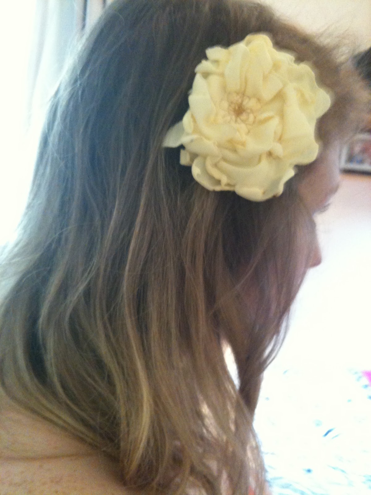
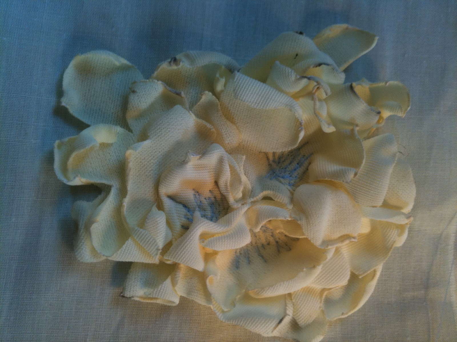
While booked into the laser cutter i decided to have a go recreating the shapes i have used for my textile flowers as they are really time consuming to make. I had hoped the heat from the laser would curl the edges to save me heating them with a candle but instead it melted the fabric and stuck the layers together. One benefit is that it does make the shapes more accurate than when cut by hand but doing them myself adds to the organic nature of the shapes and stops them looking too uniform. 

Sunday 27 March 2011

Embroidery development


While experimenting with embroidery techniques i created the piece at the top but it gathered the base material too much so i cut it out. This then lead me to think about attaching these pieces to the garment separatly which would prevent it from pulling so much (see samples in sketchbook). However, as the dresses are intended to show off my print designs, i think the embroidery will take away from this so instead i could use these pieces as elastic headbands. I am keen to create diverse accessories, all taken from my prints but in a variety of styles to appeal to everyone within my market. Seeing as i am targeting the surf/coastal lifestyle instead of an age group i want to make sure my designs appeal to all. I can see the headbands appealing to a younger girl whereas the textile necklaces being worn by someone older as a statement piece.

Dye development


I mentioned previously about wanting to create more colours in my necklaces to give them a more organic feel. I used writing inks before as they were all i had at the time but actually gave a really interesting effect so i bought a couple more colours to experiment with. I dropped pink ink onto my necklace but it looked too separate so i used a water spray to blend the colour into the fabric a bit more. I am really pleased with the results, especially as it was just an experiment initally before seeing what facilities were available in the dye room. I will develop different colours on different fabrics, perhaps more neutral base fabrics so the colours really stand out.


I want to really push the idea of my pieces being multi-functional. Tiffany mentioned i could have little kits with the accessories to help turn them into something else but i think this could put people off who aren't really into crafts. Instead i want easy ways to wear in different ways. The flower neckalce worked perfectly as a headband (the flowers stopped just at the ears). This won't be to everyones taste but the option is there.


The hair clip above was just a quick experiment when perfecting the heating technique but i would like to source some fastenings which work as a hair clip and a pin so it can be worn as a badge too.

Wednesday 23 March 2011

Stage Review

Following my stage review it has been decided i will submit 3 dresses all of the same shape and 3 simple t-shirts. I am really relieved about this as i have spent a lot of time worrying about the construction of the dresses and not getting very far. It was frustrating as at the end of the day i want my work to be judge on the print aesthetic rather than technical construction. It was also suggested to use the help of one of the technicians at uni as she will be able to produce the garments much quicker than i can!

I will also be submitting 6 textile pieces of jewellery (perhaps 3 necklaces and 3 headbands?) and 6 plastic pieces using the laser cutter (3 rings and 3 necklaces?).

I need to really consider the packaging for these so will develop this in keeping with my prints, perhaps embossing printed swing tags with an outline of the print and laser cutting my brand name out. These could also be used for business cards...

Laser Cutting


I am creating a range of acrylic jewellery (initally rings) using shapes taken from my prints. The idea was to have each part of the flower built up in a different colour but due to limited supplies i could only use yellow white and clear. Although some of the results work well, the colours don't really fit in with the prints i have developed. The shapes came out far too big (due to not formatting the Illustrator file correctly) but at least now when i order the correct colours i will not make this mistake again! I layered some of my printed crepe de chine inside layers of clear plastic which was too clumpy and the glue could be seen between. The laser sometimes leaves a burn mark on the plastic and this was only on the protective layer of the yellow acrylic but happened on the clear and cannot be removed. When the shapes are the desired size i could try this again but will need to use some form of strong spray mount to avoid the glue marks being seen. From here i am going to make a range of simple rings and a couple of collar necklaces using the same shapes. 

Tuesday 8 March 2011

Gemma Booth


gemma booth evasee 10


All the images here are shot by UK photographer Gemma Booth who describes her work as 'playful and feminine' - 2 things i want to capture as they are central to my design philosophy to create dresses which are not too serious and designed to have fun in! I am planning a photoshoot for over Easter and although my final products are not finalised it is important to get thinking about what i want to achieve so i am not rushing at the last minute! Ideally i want to shoot in a field or at the beach back home in Devon and had images of my model stood in a vast open space - eg in long grass or with the sea behind - so the dresses and accessories are the realy focus but Gemma's work has lead me to think about relevant props. These could be a picnic basket, deckchair, parasole, beach ball for example, all things which fit in with the Beach to BBQ context. Maybe even my puppy! The pictures are all really light and airy which gives off the feel of long summer days which was the starting point for my whole concept so seems fitting.

Textile development


I found the top images of petals outside a flower shop on illustrator/print designer Jilly P's blog and fell in love with the delicate colours. I'm going to go in the dye room in the week and experiment with different techniques but here are a couple i tried at home. I watered down inks and dipped the fabric in while screwed up so only some areas got covered. I had hoped these would then bleed into each other but the fabric has some sort of finish on one side which stopped the ink being totally absorbed. For the pink flowers i rinsed the fabric straight away for a more washed out look. This achieved much better results but i think i can push this further by using a better fabric and more sophisticated colours. I also experimented with shapes and tried to create flowers with just a circle but these turned out less realistic. Lastly the collar necklace i created previously was dipped in the ink and as i folded it in half to do this the ink is stronger in some places which is the kind of result i was after. Again i think this will look better with a more sophisticated palette.

Saturday 5 March 2011

Necklace development


Following on from the textile samples i have been working on i have put together the necklace above. Rather than attaching the flowers to a collar shape i have just stitched them together as this makes the shapes more organic as opposed to when they were stitched down. As some of my dresses have collars i have used a ribbon to fasten as this gives more versatility with the length. The crepe de chine i am using for the dresses does curl when heated (instead it burns and sets on fire!) so i won't be able to use my prints for the accessories unless i get them printed on something else. I think keeping them plain though will compliment the busy dresses well. For added detail i could add strips of printed fabric instead of ribbon to tie it into the collection. As this is just a mock up using some scrap jersey i had the colour is not representative of the final samples. Instead i am going to experiment in the dye room with dip dyed petals to give a more realistic flower look. I am excited about the direction of the accessories as they open up my collection to a wider consumer. Those who are wary of wearing bold prints (ie the dresses) can buy into the brand buy wearing a statement flower necklace over a plain top for example to give a bit more personality to their outfit. For this reason i will ensure a broad range in the collection of accessories - some will be plain and others more colourful. Other ideas to develop - embroidered headbands, textile flower hair clips...

Fabpad


My print samples arrived from Fadpad yesterday and have turned out really well despite some problems sending (the recommended dpi is 254 but mine were 70 so uploaded in lightening fast time but are fine so will bare that in mind when i send off for my final ones!). When i printed some out on paper some of the colours were a lot stronger than on the computer but all the samples have come out as i expected. While i understand that fabric research and sampling is really important in the design process, due to cost implications i could only test my prints on one fabric so have used a crepe de chine on recommendation of my tutors. This is one area in which i therefore think my work will be lacking but as the dresses are being made to showcase my print designs/embroidery and not my construction skills i am hoping to make up for this in my print development which is my specialist area. From here i will try out some of the textile techniques i have begun and practice some seams to get a feel for working with such a delicate fabric. 

Wednesday 2 March 2011

Toiles 1


Sketches of simple designs which can all be developed from the same blocks for ease of making!


Simple shift dress shape which will be adapted depending on style of dress (eg sleeves and collars added...)


Mock up of bow on the neckline, needs to be much wider but the length works well. Could just make it wider around the loops?


I wrapped the bow around the waist to get a feel for how the dresses will look with belts (these will be simple plaits of leather for example and without belt loops to make the dresses more versatile - can be worn with or without the belt, or with the customers own belts...) The fabric does not hang like the crepe de chine will but the purpose of the calico is to perfect the patterns and get a feel for the overall shape. The final ones will be much looser and fluid. 


Second toile with less of a flair and pleat down the front to break it up and add subtle detail. May add small buttons?


Puff sleeve inserted. Could do with perhaps being shorter? These could be in block colour or totally embroidered for added detail?


Where to go from here?

- finish existing toiles
- start and finish wrap dress
- decide how prints will work on the garments
- look into finishing once fabric has arrived (eg facings will not be suitable as the fabric is so sheer)

Textile flower samples


Following on from the samples in the previous post i began looking at ways of creating organic shapes in fabric. From the circle shapes i used before i created petals by snipping into them and lightly heating them over a candle to make the edges curl and warp. I then layered and folded the flowers to create more realistic shapes. Above is a potential design for a collar necklace and although it works well as a simple statement piece i think there is something missing. I'm hoping once i add a statement ribbon the look will come together more...