


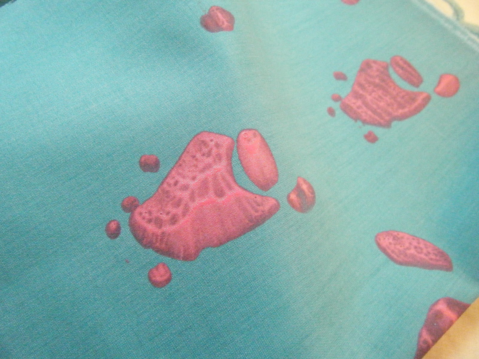

Last week i went in the dye room to do some screen printing and it was a bit of a disaster! The inital shapes (the yellow in the 1st and 2nd picture and the 3rd) came out really crisp and clean but after washing the screen down a couple times the further shapes bled and did not work at all. The idea was to layer up 4 different shapes in different colours to create the pattern but this was unsuccessful so instead i have worked into them back at home on my sewing machine (see images below). I chose to print on plain fabric and a polka dot and a striped one to see how well the screen print covers the pattern on the fabric. In the case of the striped fabric this worked well as the pink was the right consistency. Although the yellow used on the polka dot was the same consistency, i think because it is a much lighter colour the dots showed through but i really like the effect as it makes the paint blend in more rather than look like it has just been plonked on the top!


The first sample was an experiment with quilting as i layered wadding underneath but not enough to have an obvious effect. As it was difficult to appliqué accurately i traced around the outline freehand and this looks much better. In the second i used the stitches to suggest the outlines and although i like the effect of only certain parts being printed there is something missing but i think it could be that the composition is too simple - originally these were the base for several overlapping layers. In the final sample i bought together any scraps i had left and layered them over the last screen print. I am really pleased with the result and think that with a sophisticated colour palette this could work really well to add texture to my product.
No comments:
Post a Comment